Fourteen Favourites for Friday – Kitchen
by Susan from SVM Interiors Ltd
Hi. I’m posting about kitchens today. I’ve selected some images that I really rather like. It’s intersting to see how diverse my tastes are, but also how my eye is drawn to similar elements, such as a certain colour, normally blue, a texture, normally brick and a mix of both modern and decorative forms. As a designer you learn to create what your clients want and also guide them in the right direction. So whatever style it is, you create a space that’s best in it’s class.
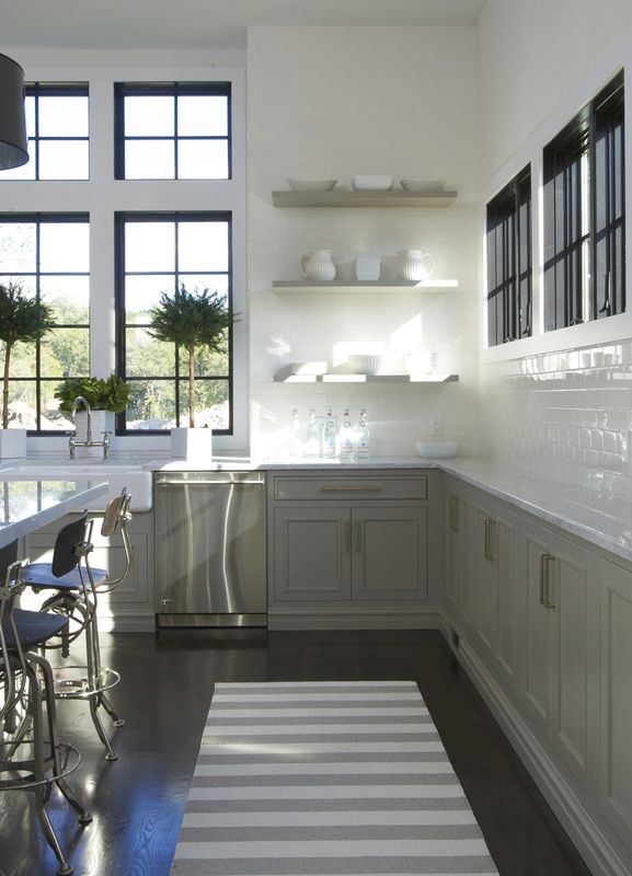
To me, this is almost perfect. Clean, simple, elegant, soft colors. Subway tiles as a back splash is popular at the moment and a classic look. Via mail.aol.com
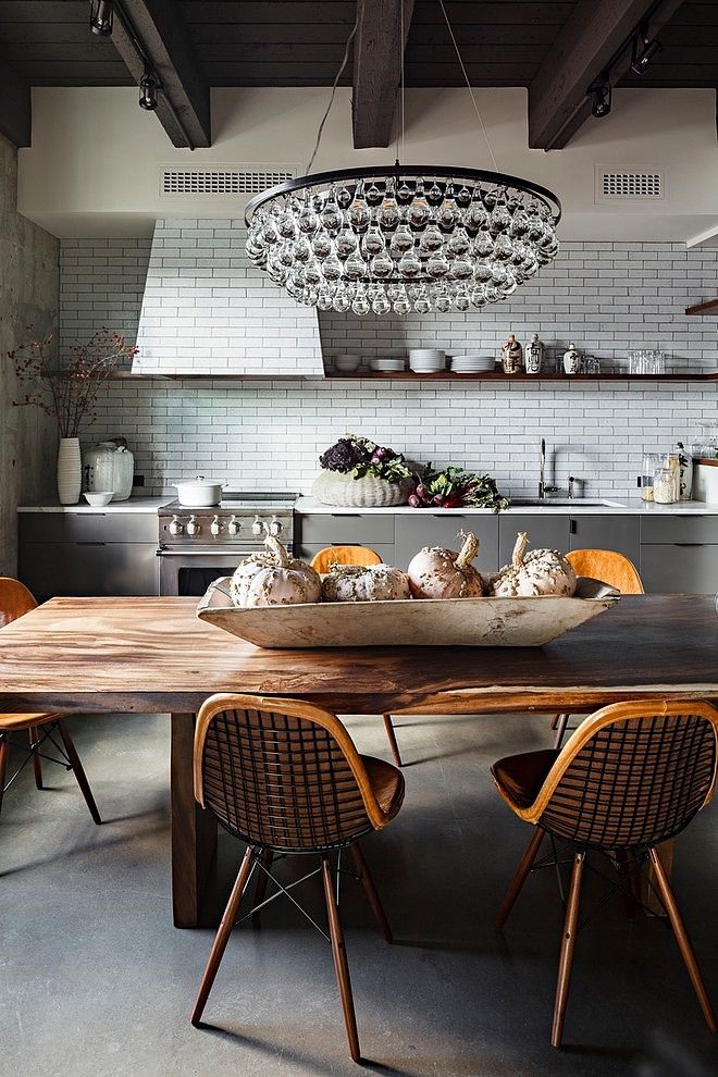
13th Avenue Loft. By Jessics Helgerson. Great texture and interest here. Loving the pendant. A comfortable kitchen.
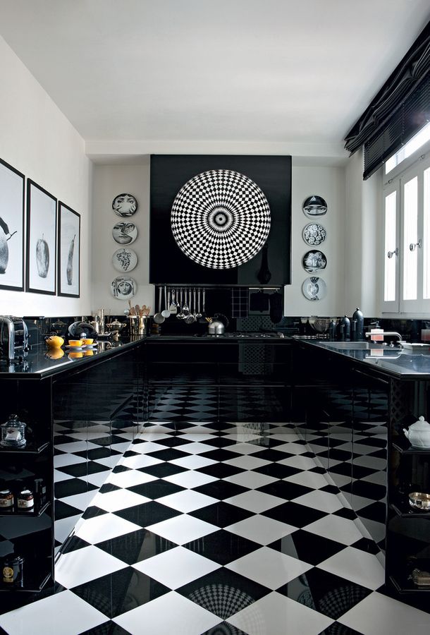
Black and white combo is stunning. No wall cabinets, a sprinkling of stuff on the counter tops makes it inviting and user friendly. The Fornasetti plates are a favourite of mine and in my kitchen at home. Via admagazine.ru
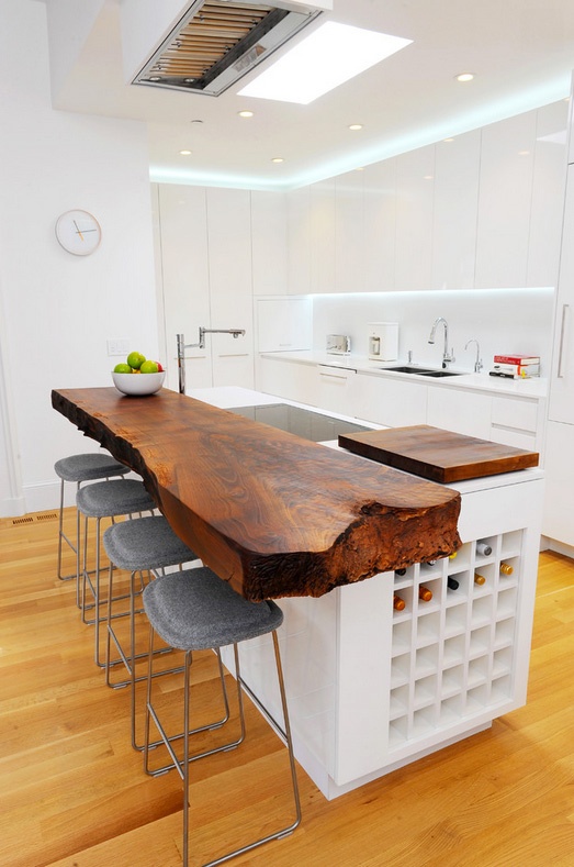
In love with this space. The minimal white cabinets contrast brilliantly with the thick plank tree island top. Via thekitch.com
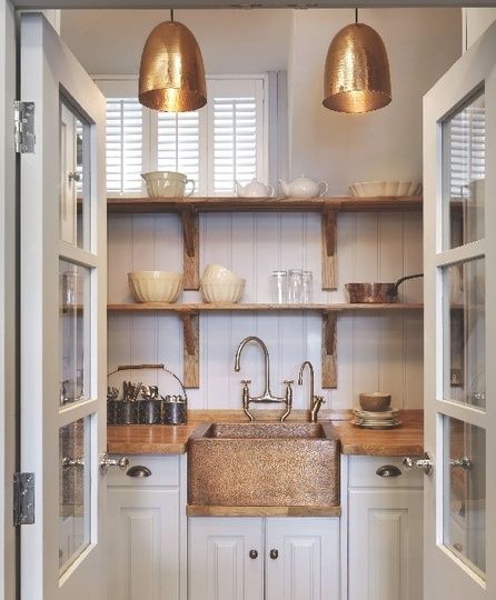
Brass accents with white traditonal door fronts, wood counter top, open shelves that are well curated, balance this tiny sapce beautifully. Via apartmenttherapy.com
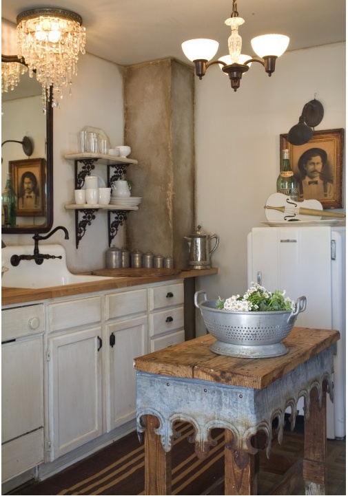
This might take you back to the early part of the 20th century. Eclectic, with oodles of character. Via placesinthehome.com
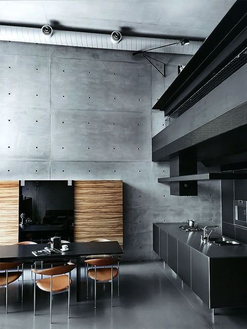
Fabulous and controlled mix of materials. Handsome and sexy. One of my favourites. Via tumblr.com
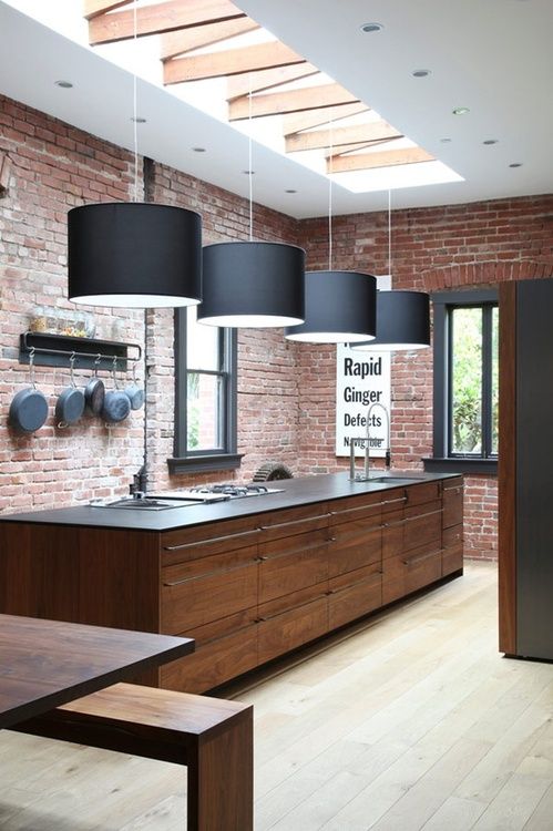
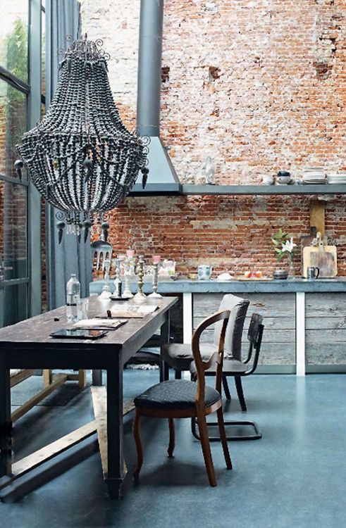
This is sophisticatingly industrial. Brick walls, dark wood, they need the light floor as a contrast to the dark units otherwise there would be no definition between timbers. Via tumblr.com
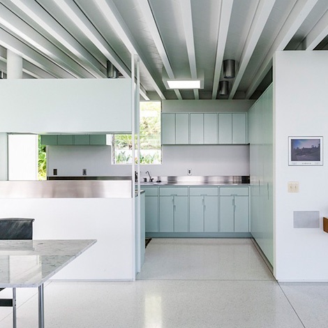
Crisp and clean. The horizontal blue band of colour in the units, breaks it up nicely. Via ianclaridge.co.uk
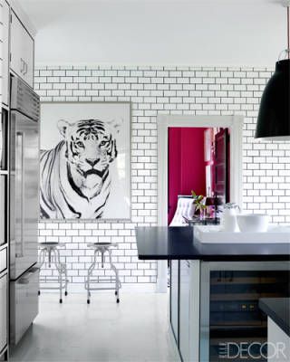
Subway tiles, again. Tiger print creates a strong focal point. Via elledecor.com
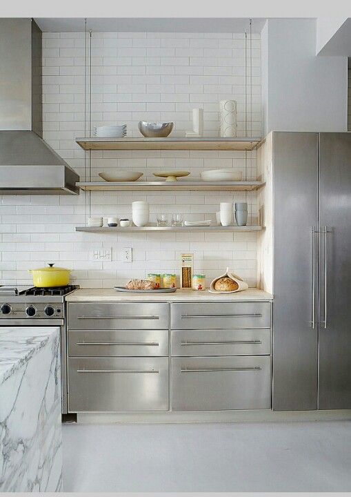
Subway tiles- again, stainless steel front units, open shelving creates a perfect balance. Via Pinterest.
Rustic, lived in, relaxed, tons of natural light and a great space to start with. Via adoreyourplace.com
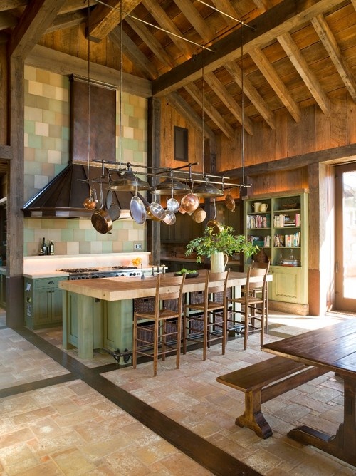
In the Napa Valley, this kitchen has stunning architecture to start with. It is well done-not-too-rustic. Via georgianadesign.tumblr.com
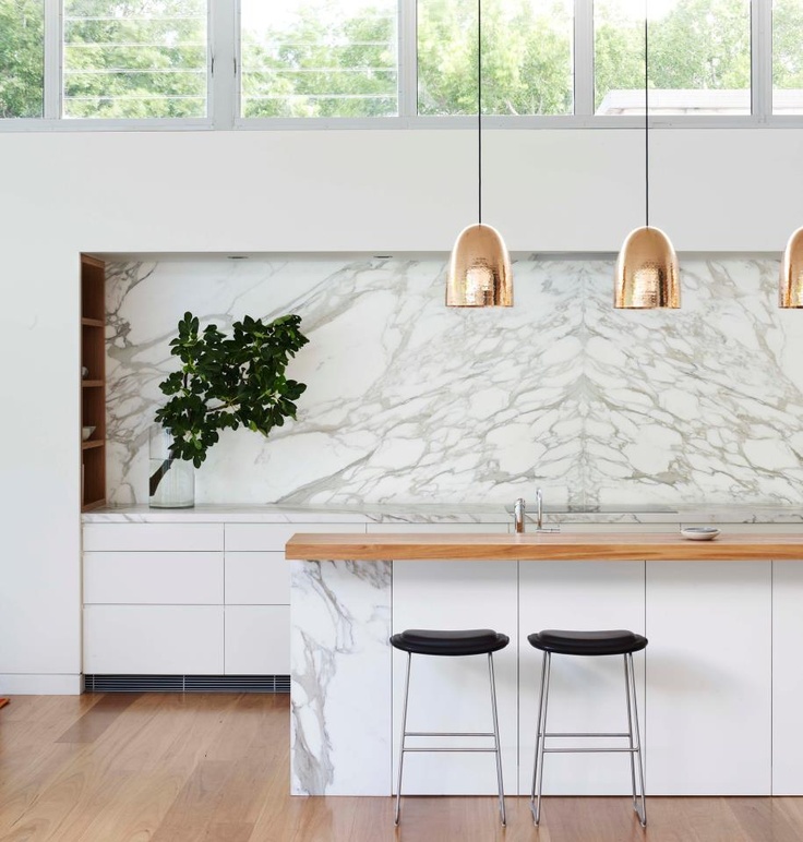
Beautiful. They have done a good job at book matching the pattern of the marble behind the cook top. White Carrera marble is lovely to look at, but it’s porous and soft. The mainteneace of this material will drive you crazy. Try a composite stone that can work just as well. Via thedesignchaser.com
All images via Pinterest unless otherwise stated.
